Making the Money Bar
___
Let's Clean House:
When I joined the QuickBooks team in 2010, QuickBooks Online (QBO) had about 400,000 users, and the company expressed an interest in migrating some of their 1.2 million QuickBooks Desktop users over to the cloud-powered QBO. There was only one problem: they didn't want to... yet.
Houston, we have a problem:
In early 2011 I noticed a trend: QuickBooks Online users felt lost. It came from all angles: The product’s NPS score was far lower than desired, feedback widgets were inundated with exasperation, and users were clinging to legacy applications, fearing the risk associated with changing platforms. Across channels, the tone of the feedback was the same: Users didn’t know how to start key workflows, find their previously-entered data, or in some cases, why they were even using the software. Quickbooks had been having the hiccups.
First, let's consider the users
While QBO is used by accountants all over the world, the average QuickBooks user is not an accountant. They’re usually someone who started a business out of their own passion, doing dozens of jobs a day and keeping expense receipts in a shoebox on the shelf. They know that they need to do their accounting by ever-looming deadlines, and that small mistakes could lead to harsh penalties. The world of accounting is a scary place for people who already have a lot on their plates, and they can use all the help they can get. We set off to investigate where people were getting stuck.
Critical Findings
___
Key Workflow Issues
Double-entry bookkeeping has a prescribed workflow, and QuickBooks was built as a categorized interpretation of those rules. As such, QBO provided a myriad of accounting tools without instructions on how they work together or why a user should engage with them. In one experimental cell, we saw a small lift in conversion and usage statistics for users who were shown an interactive “Roadmap” on their homepage. Despite its slight learning curve, it was a highly rated concept in QuickBooks Desktop.
___

Navigational Overload
Just in its navigation panel, QuickBooks had nearly 80 pages, each with a distinct, unique purpose. There was virtually no connective tissue between the pages, either, so users had to implicitly know exactly what to do with any information they entered upon saving it. This could range anywhere from sending an e-mail to updating a corresponding form elsewhere. So, not only was the information architecture too complex to navigate, it didn’t provide users with clues as to where to go next. As a result, new users suffered particularly.
___
Where's my Data?
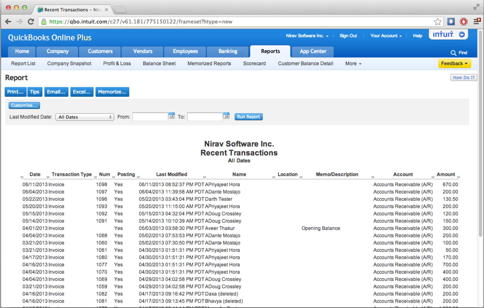
I noticed a particularly strange anomaly in the early days of QBO. Users couldn’t find anything they’d previously entered. Because of the site’s daunting structure, its users were largely navigating by clicking links from within reports. As it turned out, this was the only place that saved information ever reliably surfaced. So, if a user created an invoice and wanted to fix a typo, the only way to find it again was to open a printable spreadsheet and click a link from a plaintext list.
Design
___
Concept Testing
Along with regular internal reviews, the team invited customers to visit us at Intuit HQ or over the phone to evaluate three models.
___
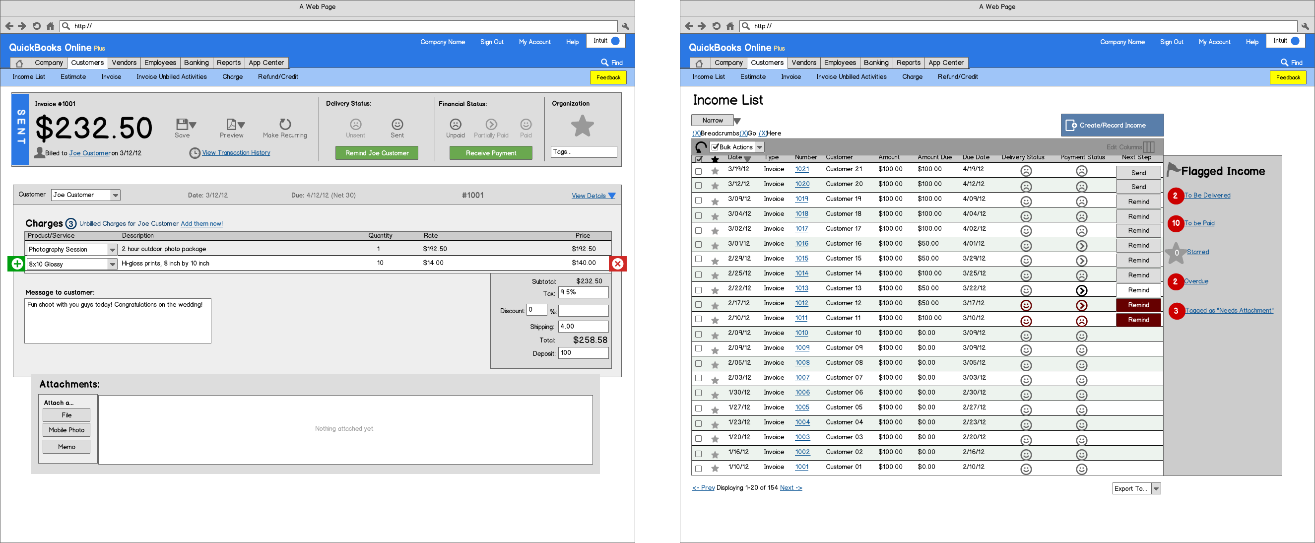
Concept A
Concept A focused on a very standard list model. Rows were selectable, with bulk actions at the top of the list. At the end of each row was a button suggesting the next step for that particular item. In the left panel, there were filter categories that, when clicked, filtered the list. This test inspired a great discussion around which ways our users wanted to filter their data, and the most important phases of their sales and expense workflows.
___
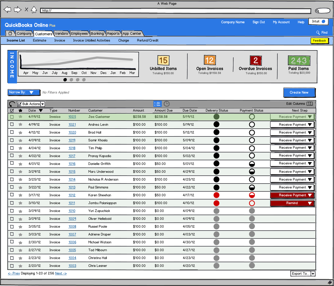
Concept B
Concept B’s intention was to gauge users’ reaction to having very simple filters above their data, compared to the many suggested in concept A. It also sought to inquire about a user’s needs for graphing with their income data.
___
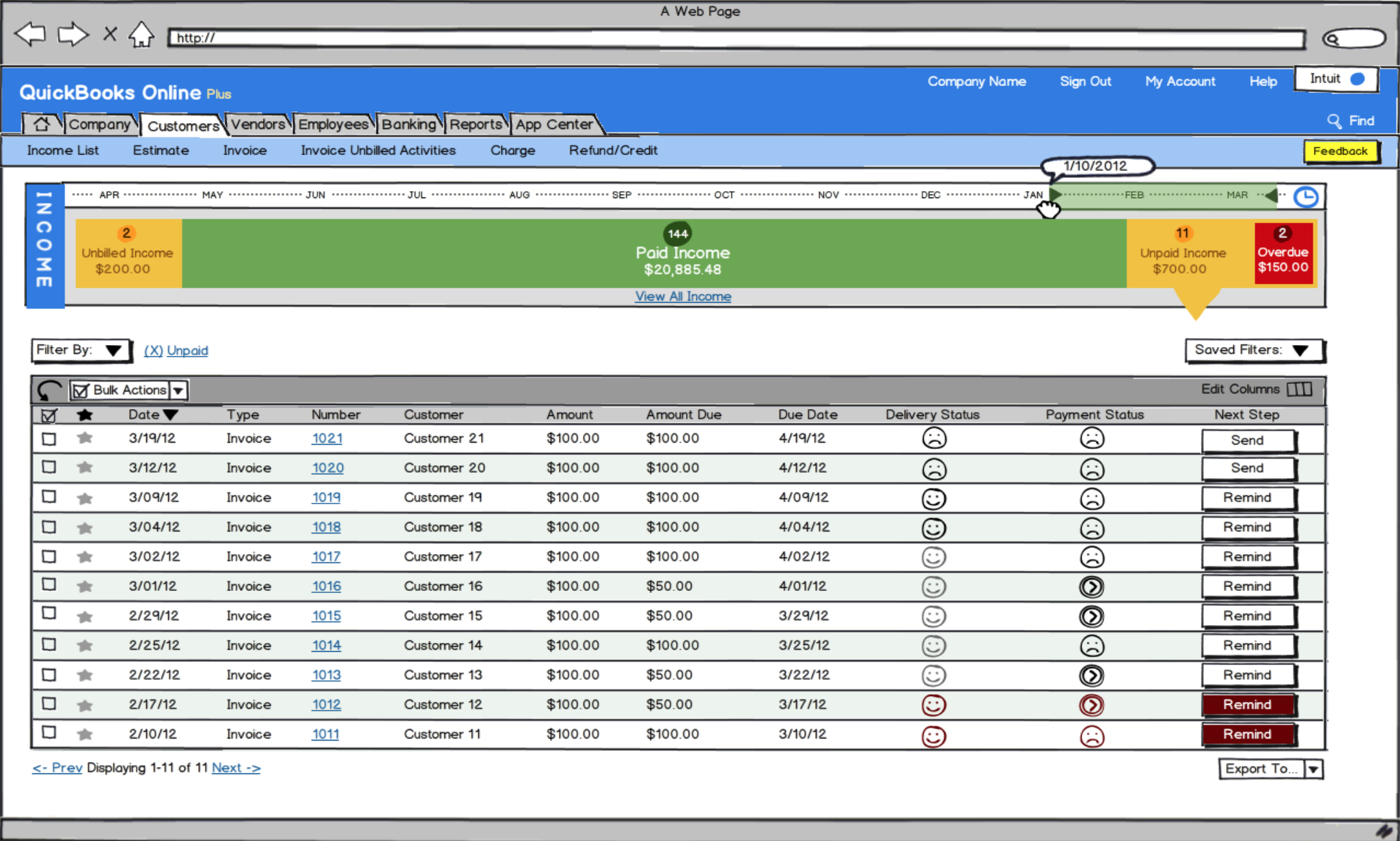
Concept C
Concept C was originally meant to be the fringe candidate. The bar across this concept represents all of the money a user has entered into QuickBooks, dividing it into “States” that groups transactions by completeness. Customers loved the concept of these states, but wanted a more simplified display of their overall company health.
___
Concept Results
After testing, what we heard was pretty consistent: Our users were concerned with the question of “What do I need to do today?” Almost every instance of guidance in the mockups was met warmly — Users preferred to work from functional centers instead of individual pages, and they liked being shown the big picture.
___
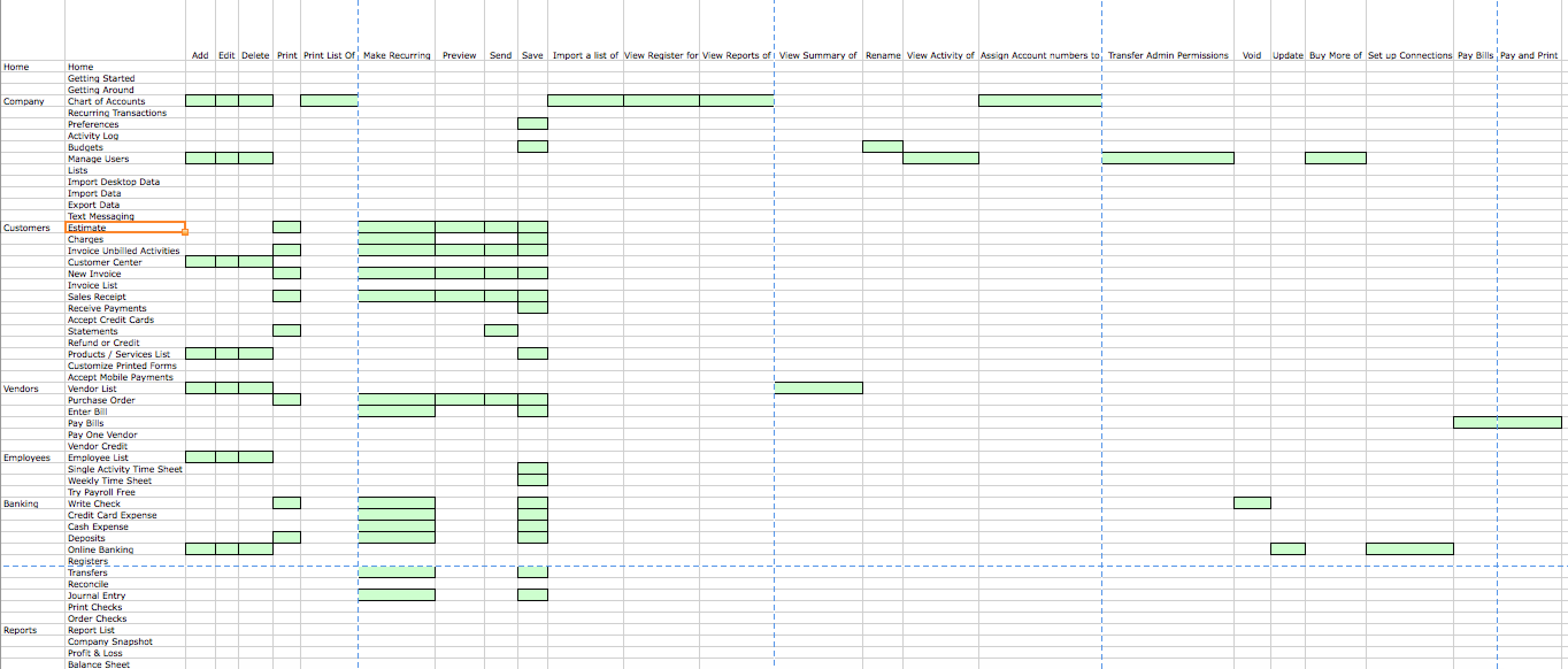
The Full Audit
Every page was audited for its overall accounting usage, placement in the QBO navigation, and connected workflows. Each page’s individual inputs and secondary actions were also cataloged and traced throughout the IA. Many a night was spent poring over these records until we had a model that represented QBO at the highest possible level.
___
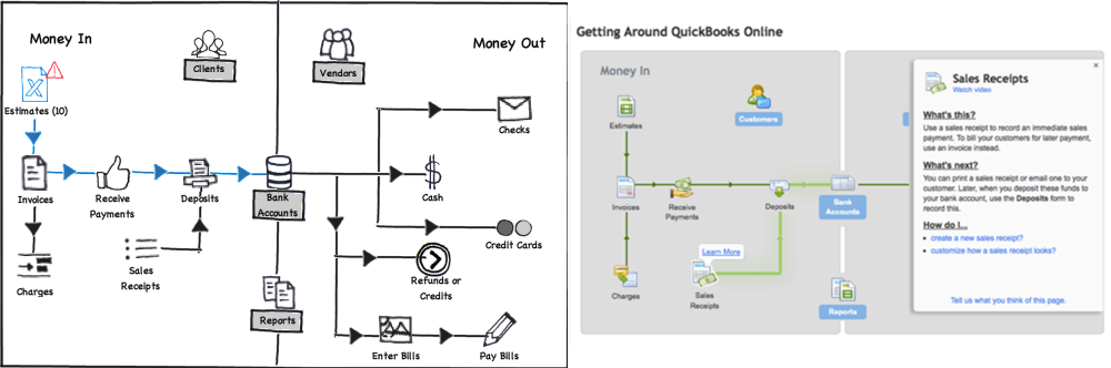
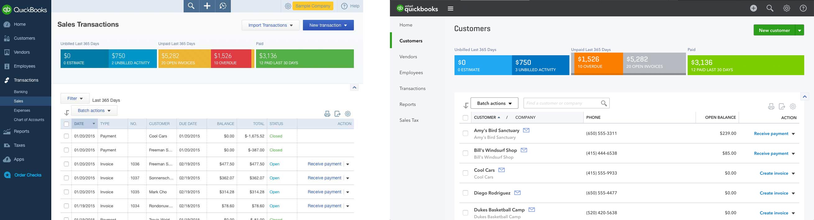
Getting to the Heart of things
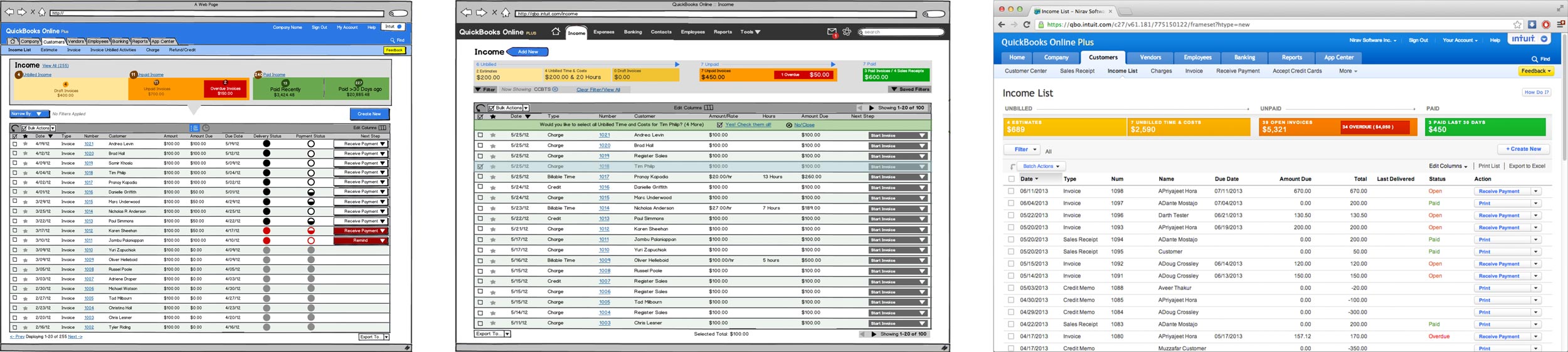
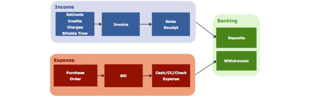
The “Beating Heart” of accounting, showing that any business transaction has 3 states: unbilled, unpaid, and paid. We confirmed our discovery: Every kind of object in the QuickBooks universe lives in these three buckets. Now we know the states, and order of those states. With that we began to design the last iteration:
Results
___
After its release, it didn’t take long for the page to climb to the #2 most visited page, after the homepage. Until Intuit launched Harmony, this page had a mean 5-star review from users. It ignited a chain-reaction at Intuit too, who used many of our team’s findings and outputs to redesign the rest of QBO along the same guiding principles.
QuickBooks Online
___
Web Application
Intuit, 2010-2014 | Visit Site | Test-Drive
The world's #1 cloud-based accounting software. QuickBooks online helps over 1.5 million small businesses get work done. PC Magazine Editor's Choice.
Case Study: The Money Bar
Case Study: Invoice Customization