Case Study: HellaShows
___
Background:
For almost two decades now, local hero Steve Koepke has been tirelessly updating his renowned Concert Guide, which comprehensively details upcoming music events around the San Francisco Bay. Upon moving to the area, I was impressed with Steve’s dedication and contributions to local music, and wanted to get his List into the hands of anyone who didn’t already know about it.
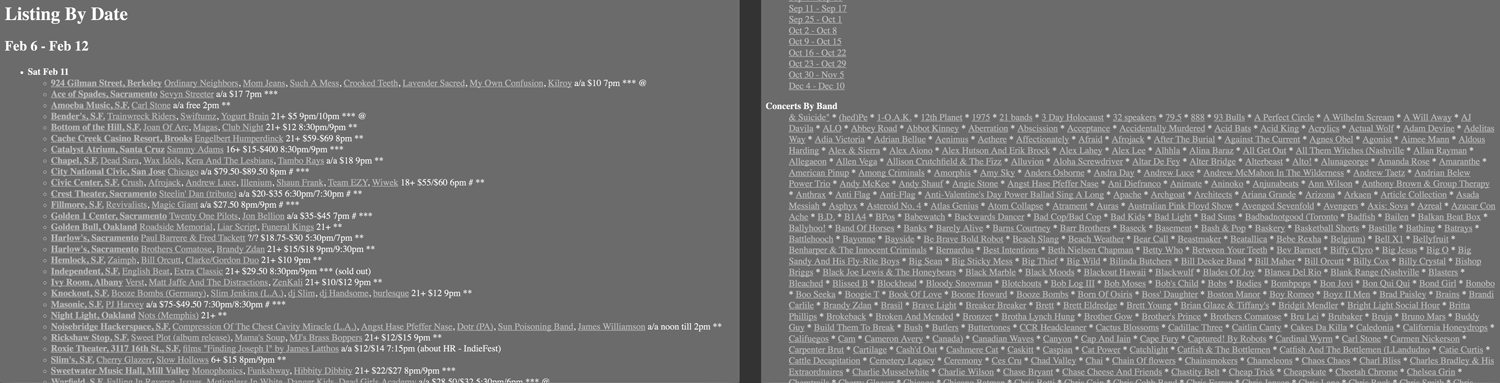
Steve’s format hasn’t changed much since 2001. Originally, the List was faxed on paper, later it became a newsletter, and finally a website. Because of this, each concert is represented by a single line of text, including symbols that represent various attributes of the show. Most commonly, a show’s line will contain its artists, time, and location. Optionally, a show’s line may include ticket prices, age restrictions, recommendation scores, and, comically, mosh-pit warnings. So while the List is comprehensive, it can be hard to read and search through. This is where I thought some product thinking might be useful.
Goals
After a quick brainstorm, we realized that Hellashows had to…
- Improve the overall usability of the source material
- Provide tools to search across shows’ metadata
- Provide tools to filter the dataset based on user criteria
- Provide actionable activities related to each show
- Look great on both mobile and desktop devices
- Cater to our local market and provide an inviting atmosphere for local entertainment
- Require minimal ongoing development (We’ve got day jobs!)
Team, Tools, and Timeline
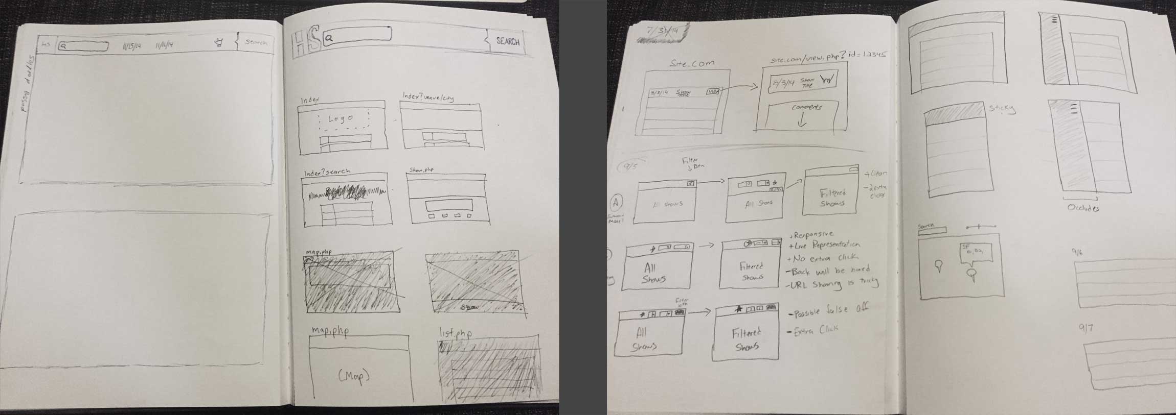
Hellashows is a fun one-off, done over the course of about a month. I handled the UX and building the front-end with PHP, HTML5, CSS, and Javascript. A working prototype was built and iterated on after an initial round of sketches. I worked with a friend who built the parsing script that collects Steve’s Data, and of course Steve himself gave us his blessing.
Visual Styling
___
Palette and Style
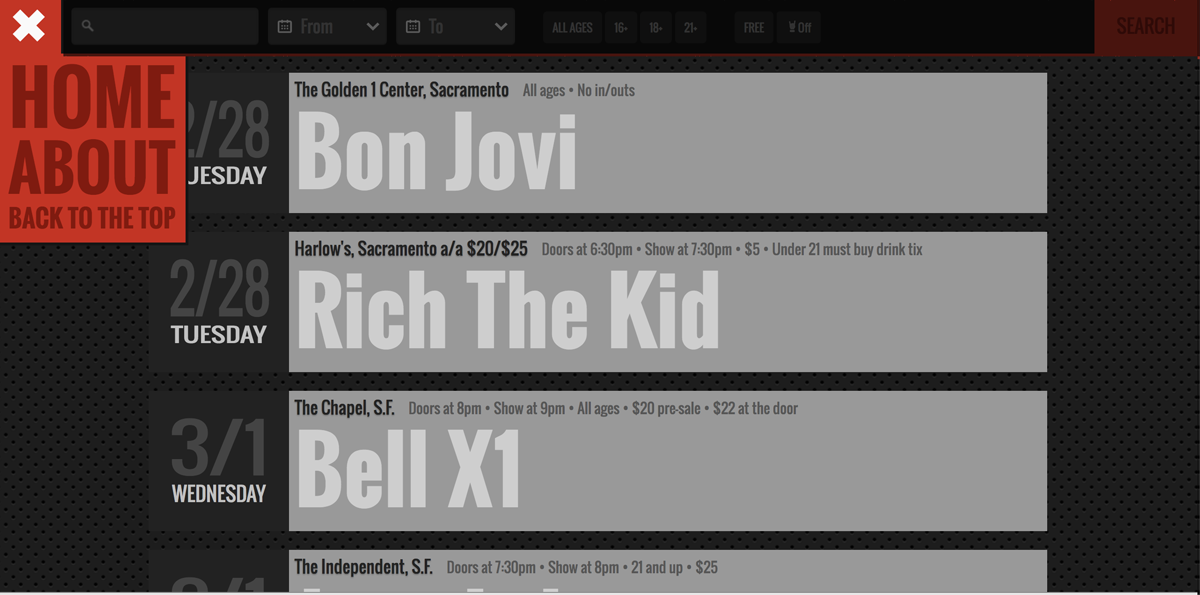
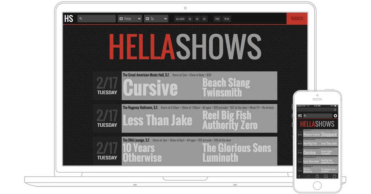
First and foremost, Hellashows had to reflect what a special place the Bay Area is for the arts. There’s a lot of local pride in various music circles here, and we wanted to emphasize that for musicians and concertgoers alike. While wanting to stay decidedly “Bay”, we began with a color we knew we had to have: International Orange, famous for its application on the Golden Gate Bridge. Using this as our hero color, other shades were chosen to reflect various selection states, and a dark, nocturnal background was chosen to contrast and highlight the use of International Orange elsewhere. The combination helps to establish a visual hierarchy and highlight affordances for users, while leaving text data easy on the eyes of scroll-happy users.
___
Bold, Beautiful Text
One of my primary motivations in creating Hellashows was to experiment with web typography. I wanted to capture the “Name In Lights” feeling from theater marquees and ticket stubs, with bold, distinctive text that remains easily-scannable, while retaining a special focus on the artists themselves. Special attention was paid to dates: Each possible date has been crafted to fit perfectly in a square. Oswald was chosen for its bold style, condensed spacing, and charismatic details. While rendering, artist names are subtly adjusted mathematically to fill up as much space as possible.
Features
___
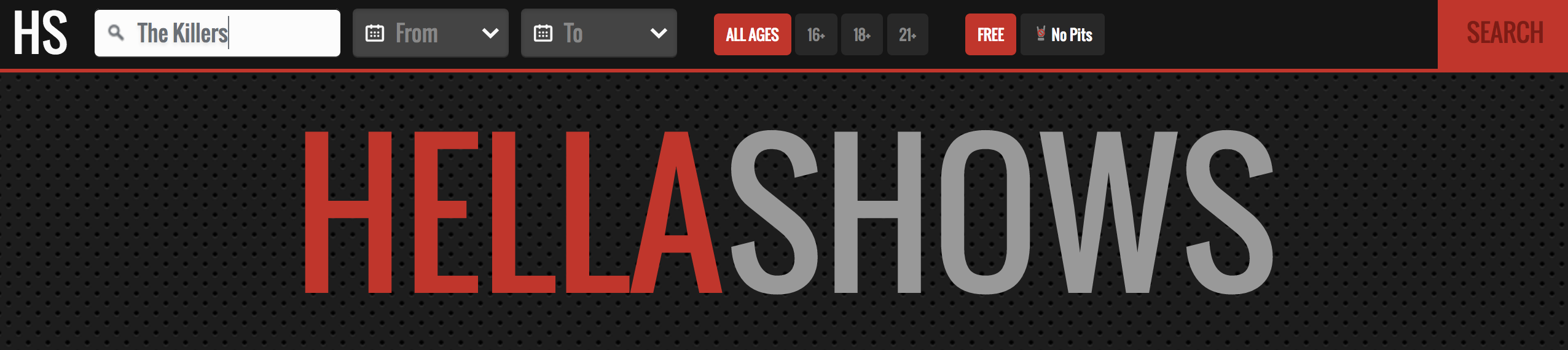
Search
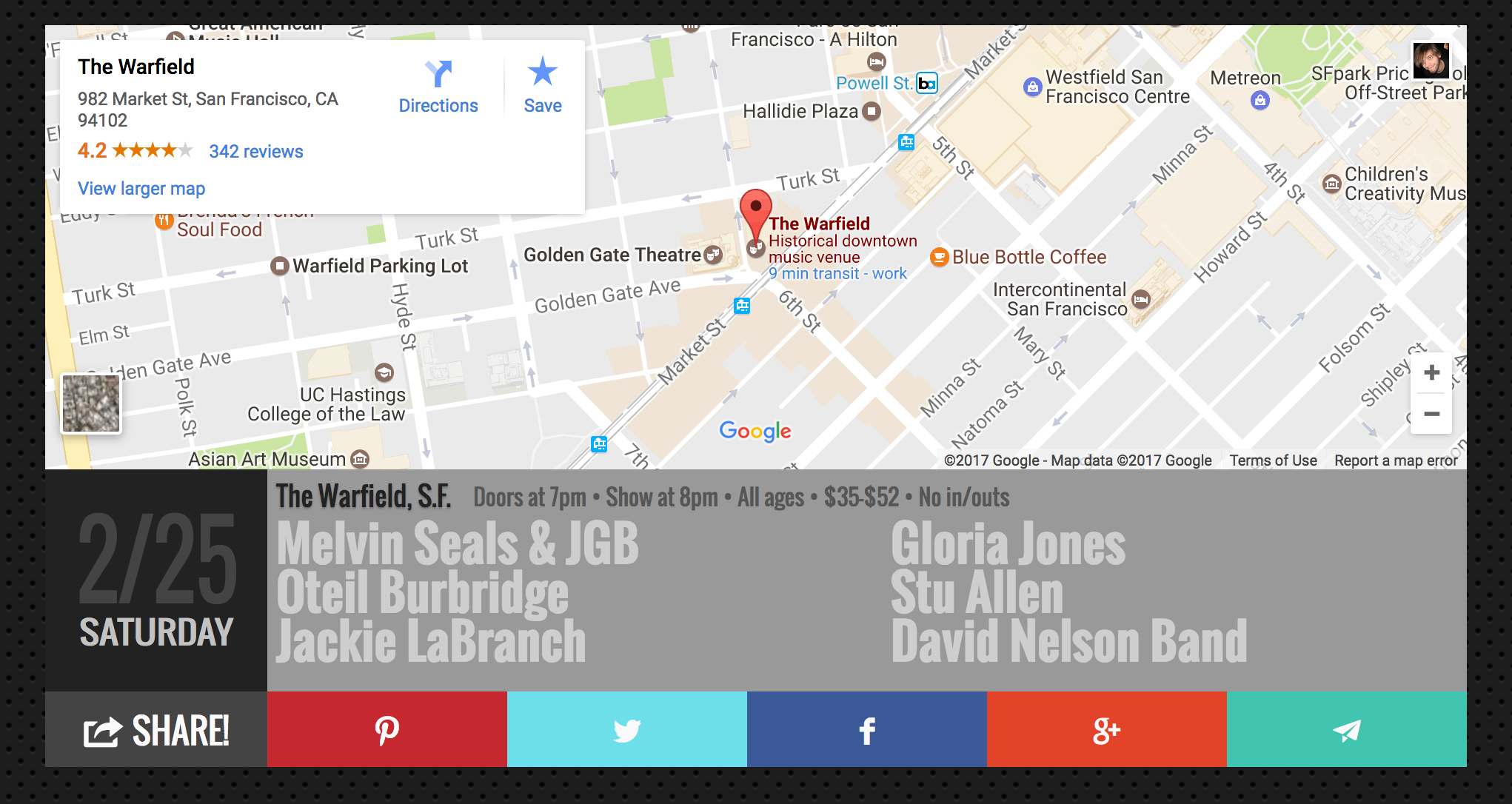
HellaShows most pronounced benefit is the ability to search and filter shows. The original List can be tricky to peruse, especially if you’re looking for something in particular. Your best bet as a user would be to read through a list of concerts by date, or to hunt through big, regularly-changing lists of artists and venues. By default, Hellashows lists shows chronologically, but users can search by keywords and filter shows by date range, age-restrictions, or cost. Clicking any venue or artist name will return filtered lists of relevant shows, so users can follow a band around the bay or see who’s coming to the Warfield this spring.
___
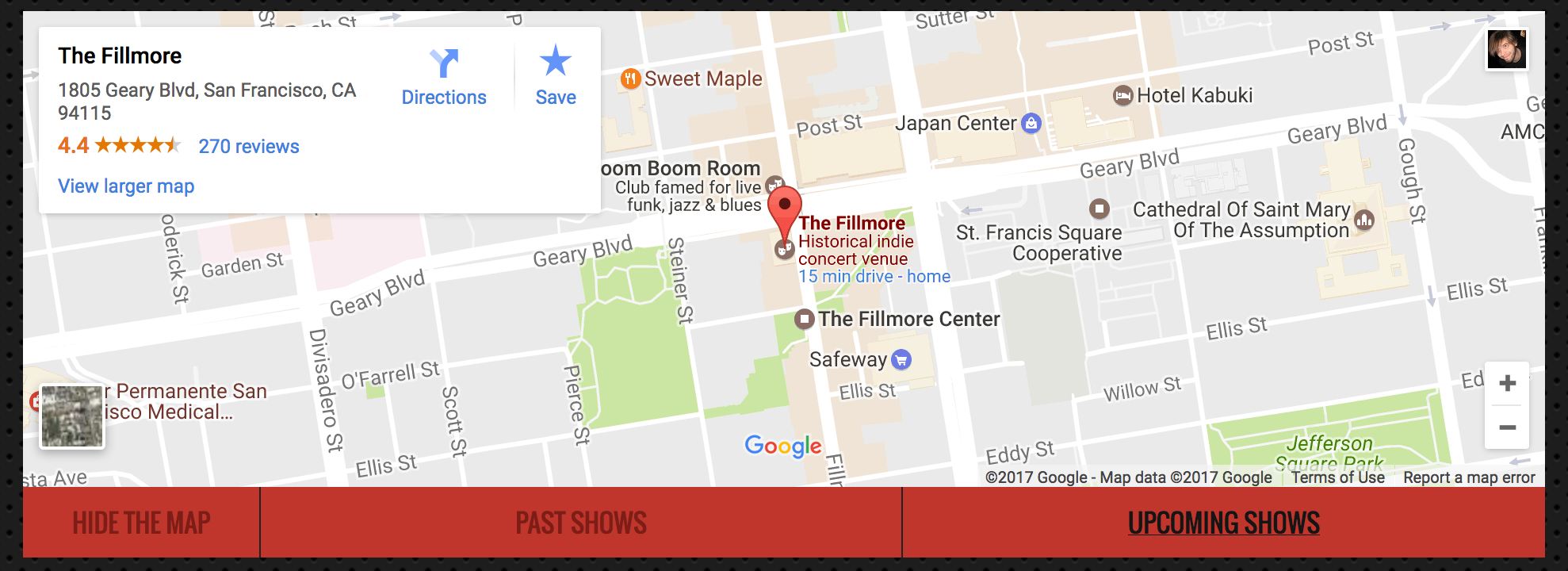
Maps
Much like a good rug, a well-placed Google map really ties everything together. Clicking any show will take you to a unique map page, shown in a format that most users will find familiar. Directions and detailed venue information are only one click away, and it works well for mobile users trying to find the venue while catching the train.
___
Social Integration
In 2001, the original List was faxed weekly and shared on bulletin boards and over water coolers. Today we’ve got social media. We wanted to provide a way that users could share the events that they’re excited about, and continue the discussion on their chosen platforms. Local bands can share their upcoming shows, concertgoers can share their weekend plans, and newcomers are encouraged to participate in and explore our thriving music community.
___
Cleverly Adaptive
Because of Hellashows’ unique focus on typography, the desktop and mobile experiences are the exact same site. The grid and text render beautifully on smaller devices, exactly as they do in a desktop browser. Only the search bar adapts to touch-powered devices, showing larger targets and a collapsible filter controller. Unlike sites that offer a different mobile experience, Hellashows retains all of it’s unique design, no matter how you view it.
Impact
___
Steve’s work continues to impress me, and I’m glad I had a chance to contribute. Our site was never intended to become a platform, to turn massive profits, or to revolutionize the way we find entertainment. It was simply designed to showcase a great dataset, promote the fine folks who make music around us, and grow the music community at large. We’ve never advertised and don’t plan to. Despite all that, however, Hellashows has a few dozen repeat-visitors every month and we continue to see it grow by word-of-mouth alone.
HellaShows
___
Web Application
Personal Project, 2014 | Visit Site
An interactive list of live music happening in the San Francisco Bay Area. Supports both desktop and mobile. Hella hunting!
Case Study: HellaShows